Fonts Keyboard Themes & Emoji
- 4.7
- Rating
- 50.00M
- Installs
- Free
- Price
 Analysis by App-foxy
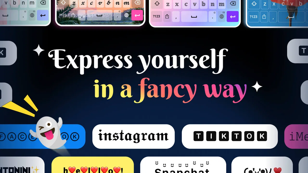
When I want to make a social post feel more personal without opening a design program, I usually look for a keyboard that gives me more than the standard letter layout. Fonts Keyboard Themes & Emoji takes that simple idea and turns it into a personalization tool for everyday typing. It combines decorative type styles, emojis, symbols, and keyboard themes, with a particular focus on places such as Instagram and TikTok.
I reviewed it as a free personalization app from Simple Design Ltd., and my impression is that it works best when you see it as a quick writing accessory rather than a complete replacement for every keyboard on your phone. The appeal is immediate: choose a style, type, copy or send the result, and return to normal typing when you need speed. That convenience explains why it has become such a widely used app, with more than 50 million installs and a 4.7 average from roughly 472 thousand ratings.
My recommendation depends less on whether you like decorative text and more on how you communicate. If your captions, comments, profile descriptions, messages, or usernames benefit from visual variety, this keyboard can save time. If you mainly need fast, accurate typing, advanced multilingual support, or a highly specialized productivity keyboard, a conventional alternative may suit you better.
You May Also Like

 AccuWeather: Weather Radar
AccuWeather Review: A Quick, Clear Forecast for Everyday Decisions
For everyday plans, the best forecast is the one you can understand quickly. AccuWeather makes rain timing, radar, and local conditions easy to act on, with a few trade-offs.

 Hill Climb Racing
Why Hill Climb Racing Still Turns Crashes Into One More Run
A tiny car, a bumpy hill and one more upgrade: Hill Climb Racing keeps resurfacing because its simple chaos makes every near-miss feel personal.

 AliExpress - Shopping App
AliExpress Makes Global Shopping Feel Personal, but Shoppers Bear the Risk
AliExpress turns a global marketplace into a pocket-sized discovery engine. Its reach is useful, its shopping loop compelling, and its trade-offs easy to miss.

 Lords Mobile: Kingdom Wars
Lords Mobile Is a Kingdom-Building Routine, Not a Quick Match
A case-by-case verdict on the building, battles, device demands, and social commitments that make Lords Mobile rewarding for some players and exhausting for others.

 PDF Scanner app - TapScanner
TapScanner Makes Paperwork Easier to Capture, Check, and Share
TapScanner makes scanning with a phone feel less like a rescue operation and more like a dependable step in getting work done. Its capture tools are useful, though not flawless.

 Block Blast!
 Shows How Much a Puzzle Game Can Leave Out
A quiet grid game shows why puzzle players increasingly value instant clarity, repeatable skill and low-pressure play—and where the genre still needs to catch up.
More From Our News Desk
View All News


How I would decide whether to install it
I would decide by watching what I reach for after the first burst of curiosity: do I actually style captions, profile lines, or playful messages, or do I mostly return to plain typing? A short trial built around one real posting routine is more revealing than browsing every option. If the app makes that routine easier without slowing ordinary messages, it has a good chance of earning a lasting place.
Start with the kind of text you actually write
The first question is not how many fonts are included. It is whether you regularly need text that stands out. Someone who posts short captions, builds a themed profile, writes invitations, or enjoys expressive messages will notice the benefit quickly. Someone who spends most of the day writing work emails may find the decorative choices interesting for a few minutes but not useful enough to change their routine.
I found the app easiest to judge by separating three jobs. The first is expressive typing: changing the appearance of words before sharing them. The second is quick access to symbols and emojis that are less convenient to find through the standard keyboard. The third is visual customization, where the keyboard itself becomes part of the phone experience through themes.
Those jobs overlap, but they are not identical. A person may love the themes while rarely using unusual fonts. Another user may care only about stylized captions and keep the keyboard appearance simple. That flexibility is one of the better reasons to try it, because you do not have to use every part of the app for it to be worthwhile.
Think about compatibility before building a habit
Decorative text is not the same as changing the font inside an app. In practice, these styles are generally created through special characters that look like different lettering. That distinction matters. A caption may appear exactly as intended in one service and look less polished in another if the destination handles those characters differently.
I would therefore test a few styles in the places where you actually communicate before adopting one as your signature. Try a short caption, a profile line, a private message, and a comment. This small check can reveal whether spacing, symbols, or unusual characters behave comfortably in your preferred apps. It is a more useful test than simply browsing the style gallery.
There is also a readability trade-off. Highly ornamental text can attract attention, but it can be slower to scan and harder for some people to understand. I prefer decorative lettering for a short heading or a few emphasized words, while keeping longer explanations in ordinary text. That approach preserves the personality without making the reader work.
Consider the keyboard as an everyday tool
Because this is a keyboard app, the important decision is not only visual. You will also be interacting with it while typing. A keyboard can look attractive and still feel inconvenient if switching layouts interrupts your flow or if you frequently need functions that are more refined in your usual keyboard.
For occasional use, the answer is simple: activate it when you want a special style and switch back when you need normal writing. For constant use, spend more time testing the layout, the theme controls, and the way you move between regular and decorative input. The best setup is the one that reduces friction rather than adding another step to every message.
The app supports Android devices running version 6.0 or later, which makes it accessible on a broad range of phones. It is free to install, and optional in-app purchases range from twenty-five cents to $12.99 per item. I would begin with the free experience and only consider paying if a particular theme or style becomes part of your regular routine.
Who will get the most from it
I see four especially suitable audiences. Social media users can use it to give short captions and comments a recognizable look. People who enjoy customizing their phone can combine the keyboard’s appearance with their broader visual preferences. Students and casual creators may appreciate having symbols and expressive text close at hand. Finally, anyone who sends playful messages can use it as a faster alternative to repeatedly searching for special characters.
It is less convincing for users who need a keyboard primarily for speed, formal writing, accessibility-focused controls, or demanding language workflows. I would also hesitate to recommend it as the only keyboard for someone whose work depends on precise editing and a familiar professional layout. In that situation, a standard keyboard can remain the better daily driver, with this app used only when visual styling is genuinely useful.
Where Fonts Keyboard Themes & Emoji wins in daily use
In daily use, I find the biggest advantage is being able to shape a small piece of text while I am already writing, rather than interrupting myself to visit a separate tool. The useful habit is selective styling: keep the main message clear, then use a font, symbol, or emoji where it adds meaning. That approach makes the keyboard feel like a practical creative shortcut instead of a novelty I have to keep exploring.
It turns visual styling into a typing action
The strongest part of Fonts Keyboard Themes & Emoji is the short path between an idea and a styled result. Instead of writing in one app, opening another tool, generating text, copying it, returning, and pasting, you can work closer to the place where the text will be used. That matters when you are preparing a quick caption or replying to a comment and do not want to break concentration.
I especially like this approach for short pieces of text. A title, greeting, call to action, or name can be styled without turning a small task into a design project. It is not a substitute for full typography controls, but it is much more practical than treating every social post like a graphic layout.
The keyboard format also encourages experimentation. You can type a phrase, compare a few appearances, and decide which one suits the mood. That is more natural than committing to one decorative style in a separate editor and discovering later that it feels too heavy for the message.
The combination of fonts, symbols, and emojis is more useful than any one feature
Many personalization tools focus on a single visual trick. This app is more useful because it brings several forms of expression together. A styled phrase may need a symbol at the beginning, an emoji at the end, or a small decorative separator in the middle. Having those elements within the same typing environment makes the workflow feel less fragmented.
One practical technique is to use a visual hierarchy rather than decorating everything. I might keep the main sentence plain, style the opening words, and add one symbol or emoji to establish the tone. This produces a cleaner result than applying the most elaborate option to an entire paragraph. The app gives you the ingredients; restraint determines whether the final text looks intentional.
For profile descriptions, this combination is particularly handy. A short line can use a readable style for the main identity, a symbol to divide interests, and an emoji to signal personality. Since profile text is limited in space, the ability to try several arrangements directly while editing is more valuable than having a huge collection that you never test.
Themes make the keyboard feel less generic
Themes are not as important as the text styles, but they improve the experience for people who spend time customizing their phone. A keyboard is visible during countless small interactions, so changing its appearance can make the device feel more personal. I see this as a comfort feature rather than a productivity feature: it does not make a sentence better, but it can make the act of typing more enjoyable.
The useful way to choose a theme is to judge it while typing, not only from its preview. Strong contrast and clear key boundaries matter more than a dramatic background. A theme that looks impressive in a gallery may be tiring if the letters do not stand out or if the visual treatment competes with the keys. I would favor clarity for everyday use and reserve more decorative choices for occasional changes.
A realistic everyday scenario
Imagine preparing a short weekend post from your phone. You want a brief heading that feels cheerful, a normal sentence explaining the plan, and a few symbols to separate details. With a regular keyboard, you might type the sentence, search for symbols separately, and revise the heading after seeing how it looks. With this app active, you can try the heading in several styles, keep the body readable, and add the finishing symbols without leaving the writing screen.
That workflow is where the app earns its place. The gain is not that it creates professional graphic design. The gain is that a small amount of personality becomes easy to add while the thought is still fresh. For casual social content, that reduction in switching can be more valuable than advanced editing controls.
What the adoption figures suggest, and what they do not
The app’s popularity is significant: it has passed the fifty-million-install mark and carries a 4.7 average across about 472 thousand ratings, alongside around 3.7 thousand written reviews. I take that as evidence that the basic idea connects with a large audience, especially people who want simple personalization rather than a complicated design suite.
Popularity should not be confused with universal suitability. A widely installed keyboard can still feel wrong for a user who values a particular layout, specialized language tools, or minimal visual distraction. I would treat the app’s reach as a reason to test it, not as a reason to assume it will replace your current keyboard.
Small workflow tips that improve the result
My first tip is to create a personal shortlist of styles instead of browsing every option each time. Pick a few that remain readable and match the kinds of posts you make. This turns the app from a novelty gallery into a repeatable tool.
My second tip is to draft the message in plain language first when the content matters. Once the wording is clear, apply styling to selected parts. This avoids spending time polishing a sentence that you later rewrite, and it keeps visual choices from distracting you from what you want to say.
My third tip is to keep a plain version of important text before experimenting. Special characters can behave differently across services, and a clean copy is useful if a destination does not display the chosen style well. For short casual posts this takes only a moment and prevents unnecessary retyping.
My fourth tip is to use symbols as separators rather than decoration everywhere. A simple divider can make a compact profile line easier to scan, while too many symbols can make the same line look crowded. The app gives you plenty of expressive material, but good editing remains the key to a polished result.
Where the experience can become frustrating
The main limitation is that decorative text is not universally practical. Some styles are attractive in a preview but less readable in a real conversation. If you type quickly, switching styles or searching through visual options may also feel slower than using the keyboard you already know. The more often you change between ordinary and styled input, the more important that friction becomes.
I also would not use elaborate styles for sensitive or important information. Clear, conventional text is better for addresses, instructions, work details, and anything that another person must understand immediately. Personalization should support communication, not obscure it.
Another consideration is the cost of optional extras. The app is free, but some in-app items cost from twenty-five cents up to $12.99. That range makes it sensible to decide what you actually use before buying. If you only need a couple of styles and a comfortable theme, purchasing broadly could add expense without improving your everyday experience.
How it compares with the usual alternatives
The closest alternative is simply the keyboard already installed on your phone. That option usually wins for familiarity, speed, and a predictable typing experience. Fonts Keyboard Themes & Emoji wins when the standard keyboard leaves you repeatedly searching for decorative text, symbols, or a more expressive appearance.
A second alternative is a dedicated text generator or copy-and-paste font tool. Such tools can be convenient when you style text only once in a while, and they avoid making a new keyboard part of your routine. The trade-off is the extra movement between apps. This keyboard is better for frequent short edits made directly inside social or messaging workflows.
A third alternative is a full design app. That is the stronger choice when you need control over images, spacing, layers, branding, or typography that must look identical everywhere. This app is deliberately more lightweight. It helps with live text input; it does not replace a canvas-based design process.
Finally, some users may prefer a highly configurable general-purpose keyboard. That kind of keyboard may be the better fit for advanced typing habits, extensive language switching, or detailed correction preferences. I would choose this app over one of those only when visual expression is the priority and the extra customization is worth accepting a less familiar workflow.
What switching actually costs
Trying the app is low risk because it is free and its content rating is Everyone, but changing keyboards is still a habit change. You need to get comfortable with its appearance, learn where the styles and symbols are, and remember when to switch back. The time cost is small for occasional use, but it becomes noticeable if you install it expecting to use it for every message.
My practical approach would be to keep a familiar keyboard available and use this one for social writing. That arrangement gives you a clear fallback for formal text, fast searches, and tasks where decoration is irrelevant. It also lets you judge the app by real use rather than by the excitement of the first few minutes.
The current version is 1.0.55, and the app was released on October 21, 2021. Those details place it as an established personalization option rather than a brand-new experiment. I would still judge updates by how the keyboard feels on your own device, because comfort depends on phone size, typing habits, and the services where you share text.
My recommendation for different users
I recommend it to social media users who regularly write short, expressive text and want a faster way to make captions, bios, comments, and messages distinctive. It is also a good match for people who enjoy changing their phone’s visual style and want the keyboard itself to participate in that customization.
I recommend a cautious trial for users who are curious but rely heavily on their current keyboard. Install it, test a few readable styles, and use it for one real posting routine. If the switching process feels natural and you repeatedly use the symbols or themes, it has earned a place on your phone. If you keep returning to your original keyboard, there is no reason to force the change.
I would skip it as a primary keyboard if your priorities are maximum typing efficiency, professional editing, specialized language support, or a distraction-free layout. In those cases, a conventional keyboard is likely to serve you better, while a separate font tool can cover the occasional decorative caption.
Overall, I see Fonts Keyboard Themes & Emoji as a focused and approachable personalization app. Its best quality is not the promise of endless decoration; it is the convenience of bringing expressive text, symbols, emojis, and themes closer to the moment when you are actually writing. Use it selectively, keep important text readable, and treat paid extras as optional rather than necessary. With that mindset, it becomes a useful companion for social typing instead of a keyboard you have to tolerate all day.
My clear verdict: try it if your phone is also a creative and social tool. For quick captions, profile text, playful messages, and visual customization, it offers enough practical value to justify the small adjustment. For serious everyday typing, keep your usual keyboard nearby and let this app handle the moments when ordinary text feels too plain.
FAQs for Fonts Keyboard Themes & Emoji
01What features does Fonts Keyboard Themes & Emoji offer?
Fonts Keyboard Themes & Emoji provides a wide range of customizable keyboard themes, a variety of fonts, and a large selection of emojis. Users can personalize their typing experience by choosing from different themes, styles, and colors. Additionally, the app regularly updates its emoji library to include the latest trends.
02Is Fonts Keyboard Themes & Emoji compatible with all devices?
The app is designed to work on most Android and iOS devices. However, it's important to check the app’s compatibility with your specific device model and operating system version in the app store before downloading. This ensures optimal performance and access to all features.
03Does Fonts Keyboard Themes & Emoji require an internet connection?
While basic keyboard functions work offline, an internet connection is required to download new themes, fonts, and emojis. Additionally, users need connectivity for app updates and to access certain features like syncing across devices. It's advisable to have a stable internet connection for the best experience.
04Are there any in-app purchases or subscription fees?
Fonts Keyboard Themes & Emoji offers both free and premium content. While many features are accessible for free, some advanced themes and fonts require in-app purchases or a subscription. Users can choose whether to enhance their experience with these optional paid features, which are clearly marked.
05How does Fonts Keyboard Themes & Emoji protect user privacy?
The app emphasizes user privacy by adhering to strict data protection policies. It does not collect or store any keystrokes or personal information. Users are encouraged to review the app's privacy policy before installation to understand how their data is managed and protected.
Pros
- Wide range of font styles available.
- Easy to customize keyboard themes.
- Includes fun emoji options.
- User-friendly interface.
- Compatible with most messaging apps.
Cons
- Contains in-app ads.
- Some features require purchase.
- Occasional lag on older devices.
- Limited language support.
- May affect battery life.

Fonts Keyboard Themes & Emoji
Gallery